Diferencia entre revisiones de «Diagrams/en»
Página creada con «== Adding layers == A diagram can be composed of one or several layers. To add a layer to the diagram click on the "+" button located in the left side menu. center|miniatureimage|800x800px|Add layers in boxed diagrams The main layer configuration pop-up will be displayed:» |
Sin resumen de edición |
||
| Línea 220: | Línea 220: | ||
Note: for this example, the size of the plan has been reduced in order to be able to visualize the change. | Note: for this example, the size of the plan has been reduced in order to be able to visualize the change. | ||
== Adding layers == | == Adding layers == | ||
A diagram can be composed of one or several layers. To add a layer to the diagram click on the "+" button located in the left side menu. | A diagram can be composed of one or several layers. To add a layer to the diagram click on the "+" button located in the left side menu. | ||
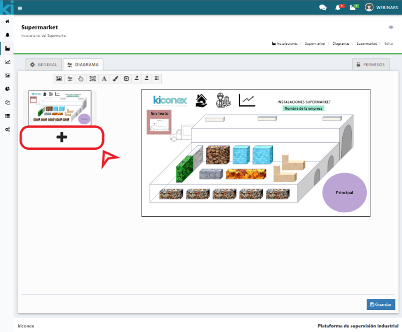
[[Archivo:SP añadir capas en diagramas con recuadro.png|center|miniatureimage|800x800px|Add layers in boxed diagrams]] | [[Archivo:SP añadir capas en diagramas con recuadro.png|center|miniatureimage|800x800px|Add layers in boxed diagrams]] | ||
Revisión actual - 08:57 28 ago 2024
Diagrams
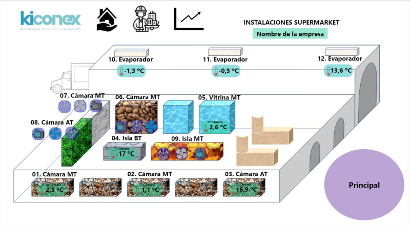
The diagrams module allows to make synoptic diagrams of one or several facilities in SCADA mode where images and variables can be mixed in real time to obtain status and operation information on a simple screen.
The configuration of these diagrams is done directly in myKiconex platform in an easy and intuitive way. Images, analog variables, digital variables, dynamic icons, action buttons, layer change links...etc. can be included.
The variables configured in each diagram will be displayed in real time and can be plotted by clicking on the different elements.
In addition to the above, there is a full screen view mode in myKiconex web app. In this way, the diagram can be viewed as if it were a stand-alone SCADA application including all possibilities for viewing, navigation, interaction, etc.
Diagram Configuration
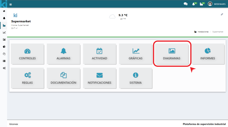
To create a diagram, access the facility and then navigate to the "Diagrams" subsection.
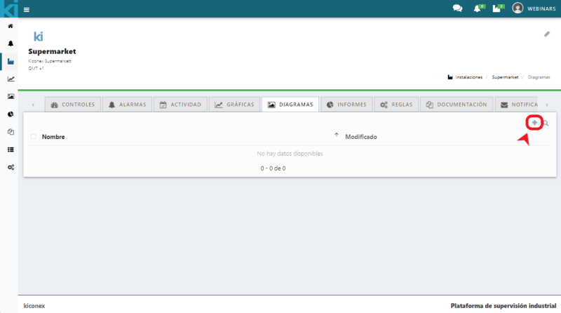
When accessing, you can find the list of diagrams. If any diagram is available, the name, description and date of the last modification will be displayed. If a diagram has already been created, it will appear in this list. Otherwise, a new one can be created by clicking on the + icon.
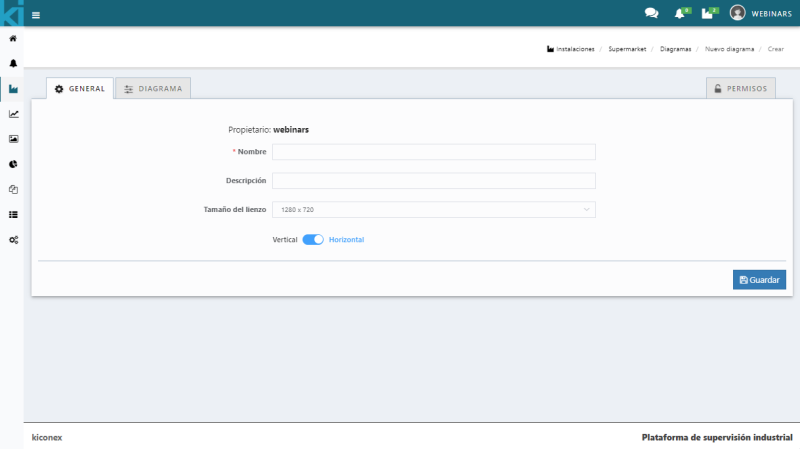
By clicking on the + icon, you can access the diagram general configuration panel where the name and description of the diagram must be configured. Next, you must select the canvas format to be used. By default it comes with the dimensions 1280 x 720 pixels, although you can choose between 800 x 600px up to 1920 x 1080px, both vertically and horizontally.
The next step is to access the diagram tab where the content of the diagram is defined.
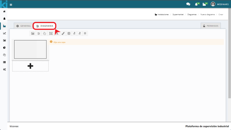
The main thing is to choose a layer as the main layer, this will be the initial screen when opening the diagram. Once chosen, a layer with a grid will be displayed. By clicking on save, on the bottom icon of the diagram, all changes will be saved.
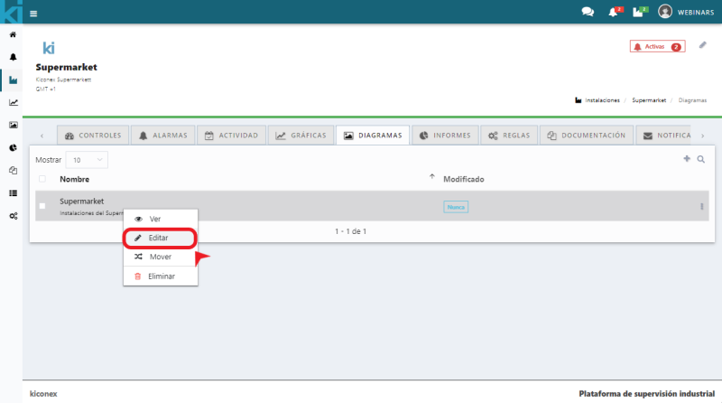
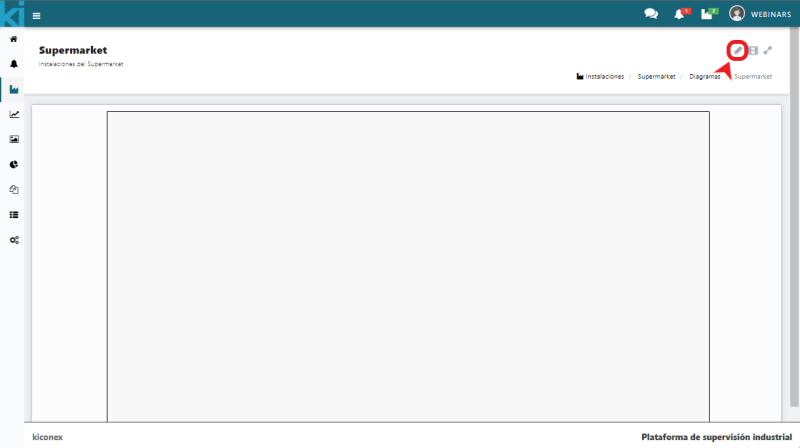
To modify an existing diagram, right click on a diagram and select edit. You can also enter the diagram and click on the pencil icon to edit it.
Layer configuration options
Layer configuration options The following icons are the diagram configuration icons:

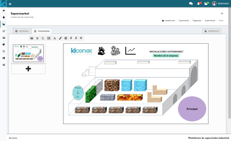
The description of each icon from left to right is:
- Add image. Add a background image or an image to be used in some element.
- Add parameter. Menu to select variables of a control to display in the diagram.
- Add button. Used to add a button to the diagram to perform an action when clicked.
- Add object. Use it to add a shape or object to the diagram.
- Add text. Menu to include a text with its properties.
- Change background color. Used to change the background color of the diagram.
- Add multi-action button. Use it to create a button that executes several commands simultaneously when clicked.
- Export to PNG. Exports the diagram to a .png image format.
- Export to SVG. Export the diagram to an .svg image format.
- Show/hide grid. Select whether to show or not the grid.
Add image

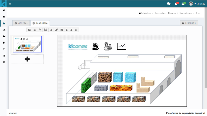
By clicking on the icon a new new object panel appears. Here you can load the image to be used to represent in the diagram. For instance, a plan of the facility where all or some of the devices to be monitored are located, a circuit of an equipment, ect. among others.
Two tabs appear in this pop-up. The first tab Text will allow the user to name this image and configure the size. The text of this name will be displayed in the image the user uploads.
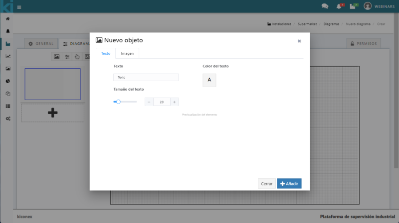
The next tab is Image, where the user can upload the image and set the file size. It can also preview the element.
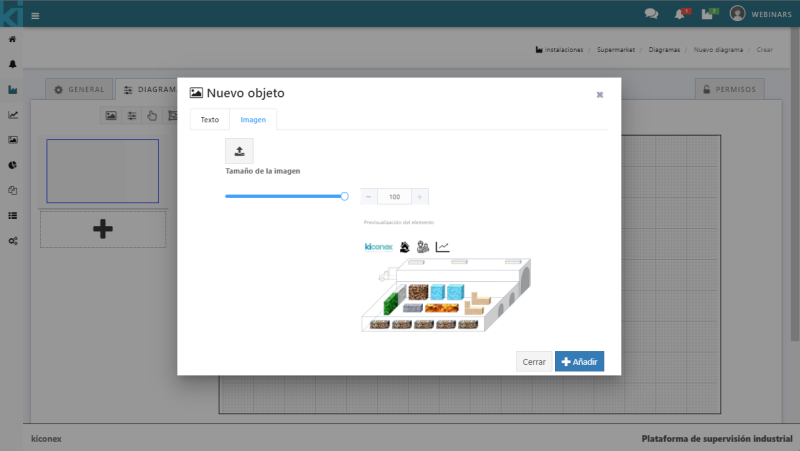
By clicking on the add button the image is uploaded to the diagram. Once the image is uploaded, the configuration box will close and the image will appear so that it can be placed in the desired position.
Add parameters
To add parameters, click on the icon shown below in the diagram configuration bar:

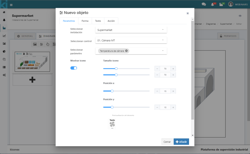
Once the icon is clicked, a configuration panel for this parameter will appear. It has four configuration tabs:
Parameters
Select facility: this drop-down menu automatically selects the facility to be worked on.
Select control: the control (machine or device to be monitored) must be selected.
Select parameter: the parameter to be displayed must be selected. That is, the variable to be monitored.
With the Show icon selector users indicate whether they want to display the icon (seeing a preview of the final format at the bottom of the pop-up). The size of the icon can be configured in the diagram, as well as the position of the X and Y axis.
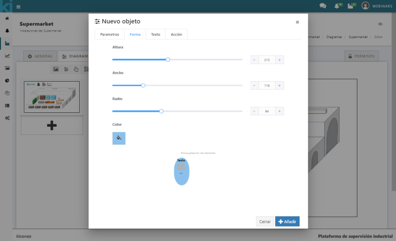
Shape
In this tab the user sets the height, width, radius and color of the area where it can access the graph of this parameter. The preview of the item will be displayed upon completion.
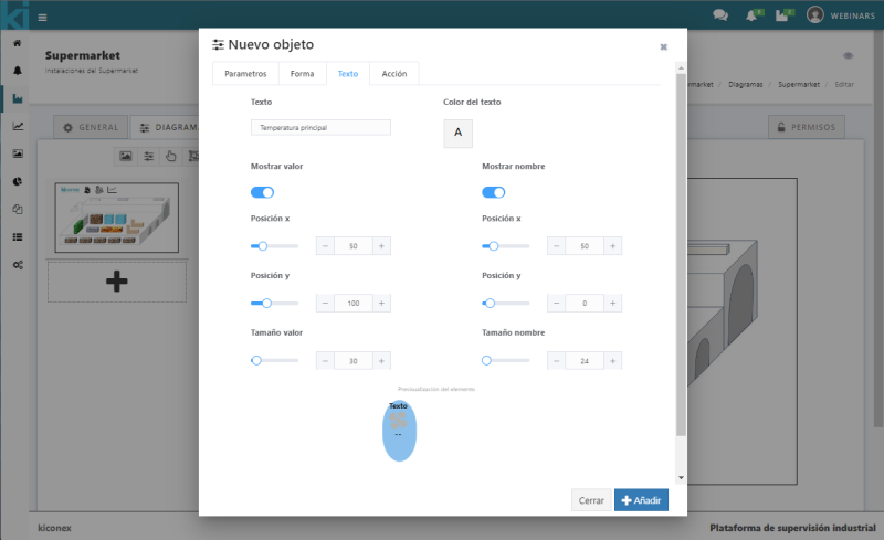
Text
The text input box is for entering the name to display that identifies the parameter. It can be the name of the room, the control or the machine, e.g.
The display of the value can be enabled or disabled and configured the X and Y position indicating the size at which the user wants to display the value. The preview of the item will be displayed upon completion.
Also the user can set the color text by clicking on the box where a color palette will appear.
The user can enable or disable the display of the name and configure the X and Y position indicating the size at which it wants to display the size of the name. The preview of the item will be displayed upon completion.
Action
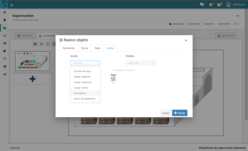
There is drop-down menu where the user can select the different actions that this parameter can perform as soon as it clicks on its area, it can change layer, load diagram, load facility, load control, go to an external link or simply the action of the parameter.
Next to it is the Destination setting that will indicate the possible options once the previous tab has been selected. The preview of the item will be displayed upon completion.
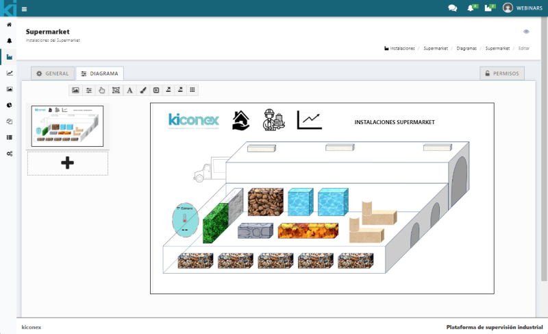
Once these configurations have been completed, click on "add" and this parameter will be added to the diagram, it can be placed wherever the user wishes.
Add button
To add a button, click on the icon shown below in the configuration bar of the diagram:

Clicking on the icon will open a configuration panel where it has three configuration tabs:
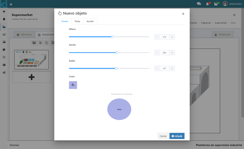
Shape
This tab is for setting the height, width, radius and color of the button area. The preview of the item will be displayed upon completion.
Text
Here is for setting the text, size and color. The preview of the item will be displayed upon completion.

Action
A drop-down menu is displayed, it is for selecting the different actions that this parameter can perform as soon as the user clicks on its area, like changing layer, loading diagram, loading facility, loading control or visiting an external link.
Next to it is the Destination setting that will indicate the possible options once the previous tab has been selected. The preview of the item will be displayed upon completion.
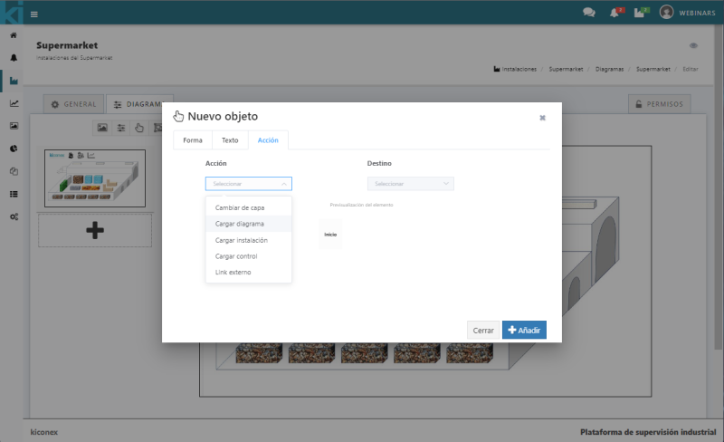
Once these configurations have been completed, click on "add" and the button will be added to the diagram. It can be placed it wherever the user wish.
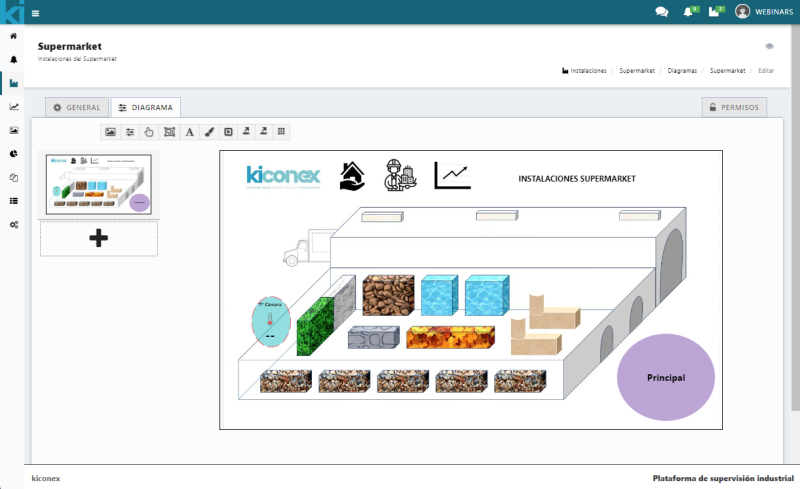
Add object
To add an object, click on the icon shown below in the diagram configuration bar:

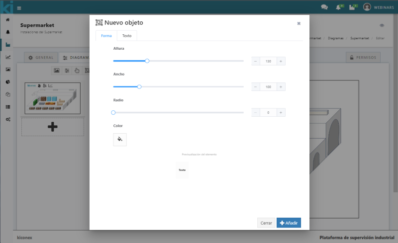
Once clicking on the icon, a configuration panel is shown with two configuration tabs:
Shape
This tab is for setting the height, width, radius and color of the area. The preview of the item will be displayed upon completion.
Text
Here is for setting the text, size and color. The preview of the item will be displayed upon completion.
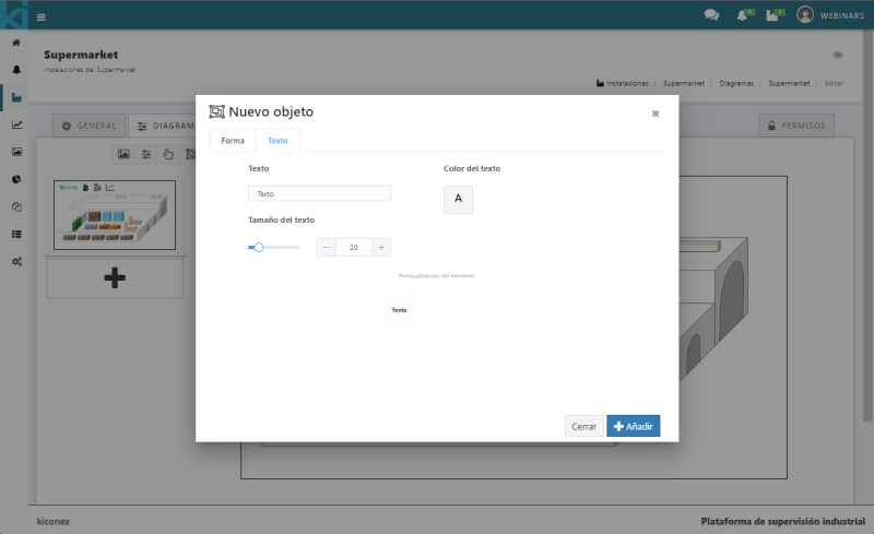
Once these configurations have been completed, click on "add" and the button will be added to the diagram, it can placed wherever the user wish.
Add text
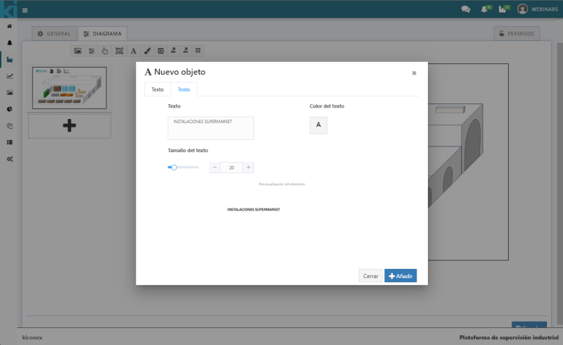
To add text, click on the icon shown below in the diagram configuration bar:

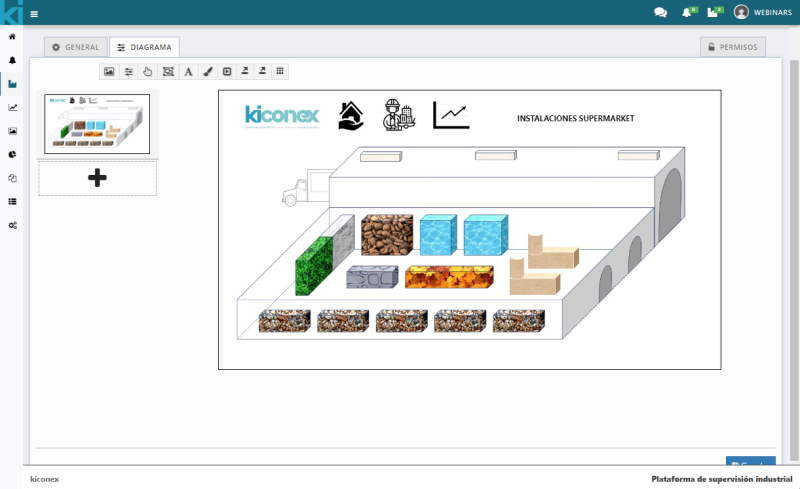
In it you can set a text you need to add to the diagram, the size and color. The preview of the item will be displayed upon completion.
Change background color
To change the background color, click on the icon shown below in the diagram configuration bar:

Once clicked on the icon, a color palette will appear where can configure the color. When finished, click on Accept.
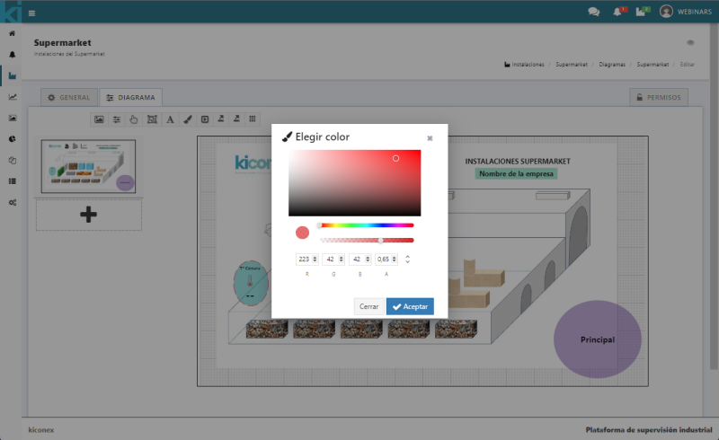
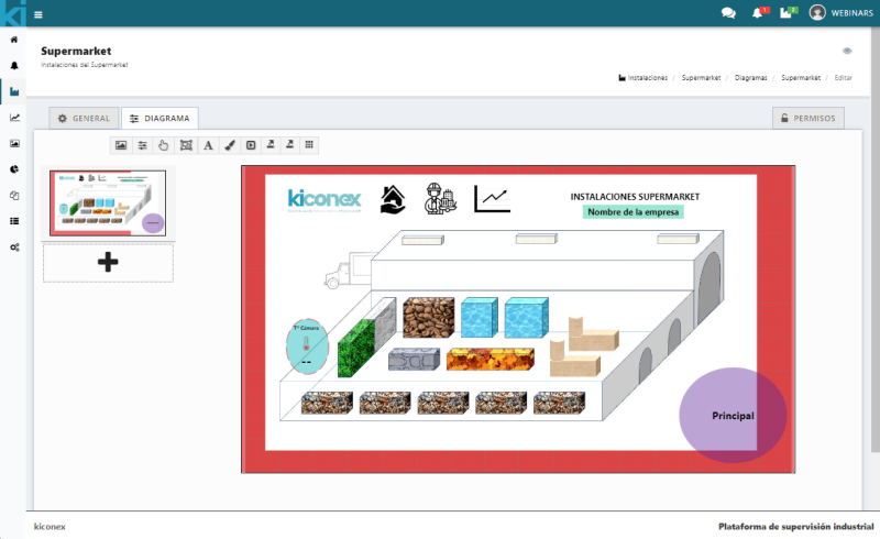
Note: for this example, the size of the plan has been reduced in order to be able to visualize the change.
Add multi-action button
To add a multi-action button, click on the icon shown below in the configuration bar of the diagram:

Once the icon is clicked, a configuration panel for this parameter will appear, it has four configuration tabs:
Shape
This tab is for setting the height, width, radius and color of the area. The preview of the item will be displayed upon completion.
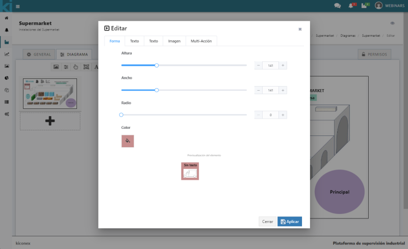
Text
Here is for setting the text, size and color. The preview of the item will be displayed upon completion.
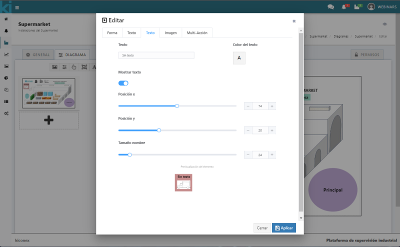
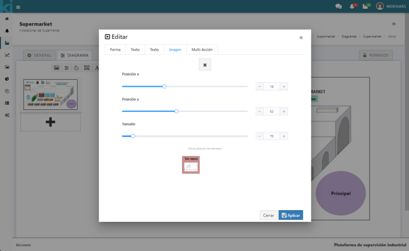
Image
There is the option to upload a representative image on the button to be added, set the X and Y axis position and its size. The preview of the item will be displayed upon completion.
Multi-action
Select the facility, the control and the command(s) that are going to be represented in the diagram, once selected click on "add" in the option below the command selection. It is possible to add several at the same time so click on "add" in blue to add the selections once configured.
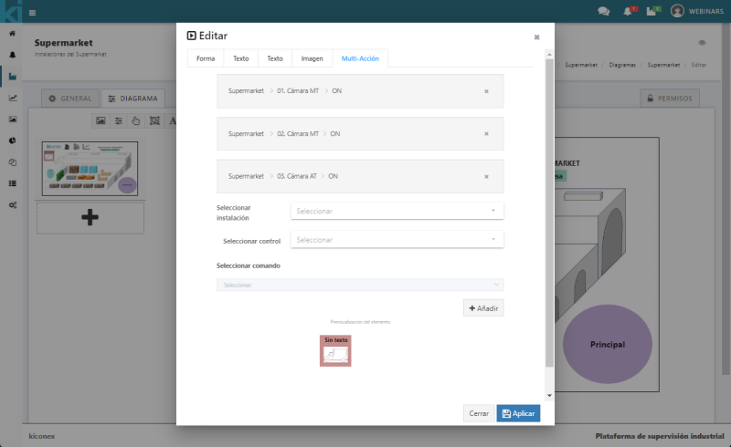
Visualización del botón multi-acción en diagramas:
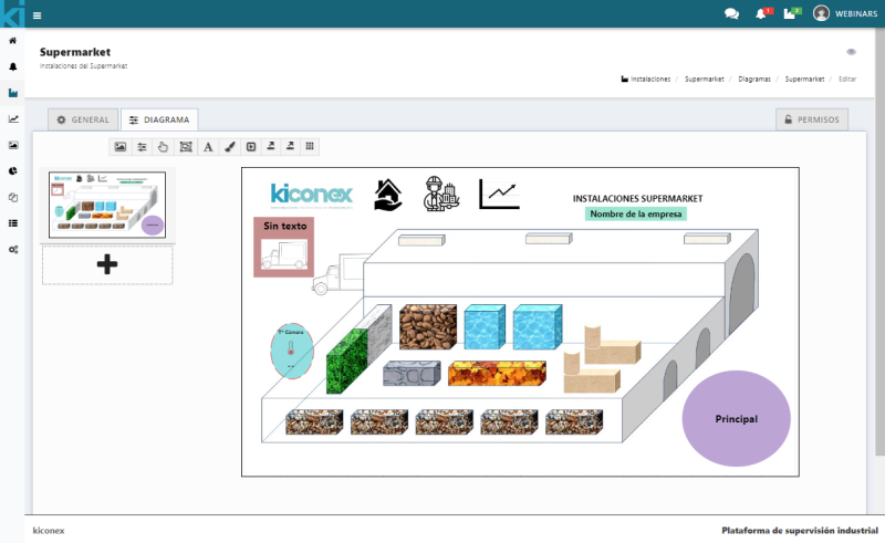
Export to PNG
To export to png, click on the icon shown below in the diagram configuration bar:

Once the icon is clicked, an image in .png format will be automatically downloaded. Check for it in the lower bar or in the download folder.
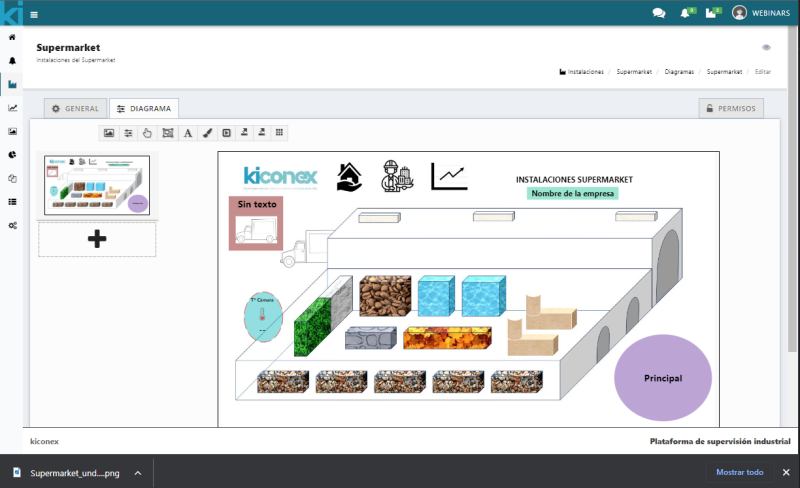
An image of the diagram design will be downloaded in .png format.
Export to SVG
To export to .SVG format, click on the icon shown below in the diagram configuration bar:

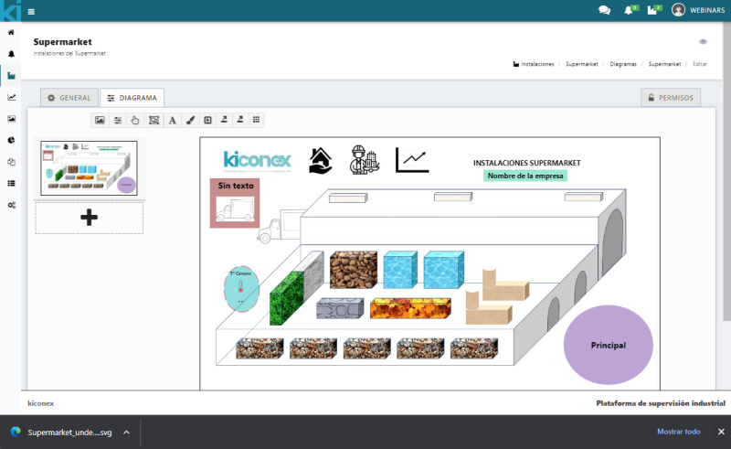
An image of the diagram design made in .SVG format will be downloaded.
Show/hide Grid
To show/hide Grid, click on the icon shown below in the diagram configuration bar:

Esta herramienta permite quitar el Grid (cuadricula).
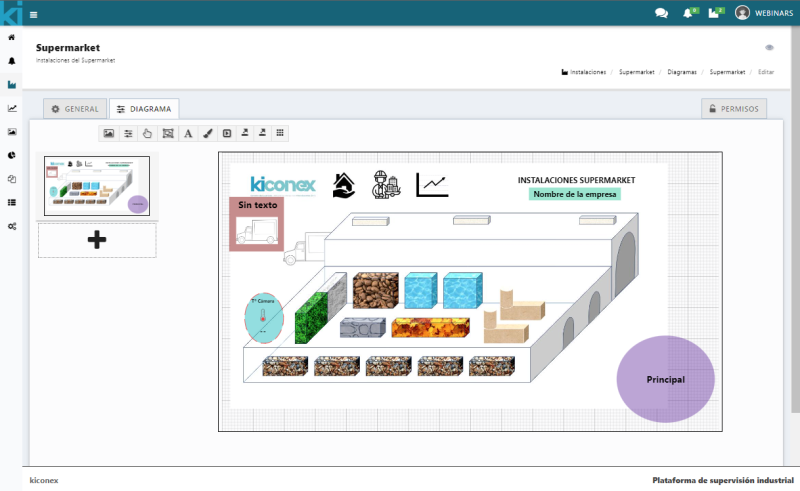
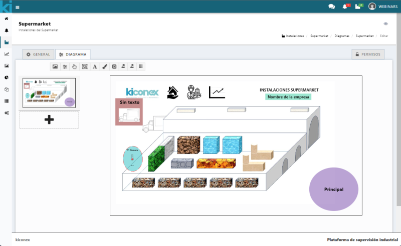
Note: for this example, the size of the plan has been reduced in order to be able to visualize the change.
Adding layers
A diagram can be composed of one or several layers. To add a layer to the diagram click on the "+" button located in the left side menu.
The main layer configuration pop-up will be displayed:
Layer name
In this section the name of the layer must be configured.
Main layer
The user must configure whether it will be the main layer or not, just check the box to enable or disable it as needed.
Configuration for presentation
Indicates "Show". The diagram works as a presentation so you can configure which layers to display and which not to display.
Selecting the layer to be displayed in presentation mode, it is necessary setting the time it is desired to be displayed for.
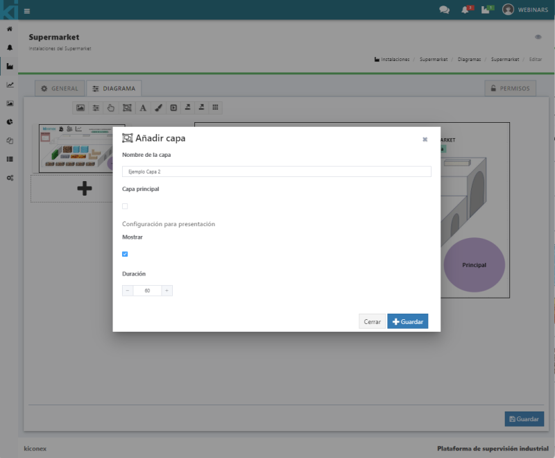
Once the above information has been configured, click "Save" and then "Save" again to finish configuring the diagram.
Permits
The operation of the permissions can be visualized in more detail in the following link.
In order for the users of the dacility to see the created diagram they must be assigned these permissions. The permissions are inherited from the permissions assigned in the facility, so if it is necessary to give less or more permissions they must be reviewed.
Click "Save" once configured to transfer the changes.
Example of a finalized diagram:
